Coca-Cola
A drink machine that knows it's empty
Designing one connected service for customers, retailers and the technicians who keep vending machines running.
Role: Lead Product Designer · When: 2017
[Add photo: the connected vending service, from machine to app to technician tool]
A vending machine is a simple promise: walk up, choose a drink, and buy it. But that promise depends on a system most customers never see. Products need replenishing, faults need diagnosing, and technicians need the right information to keep machines running.
This project explored how to connect those separate activities into one coherent retail service, spanning the customer experience, the vending machine itself, retailer operations and field maintenance.
The challenge wasn’t simply to design four interfaces. It was to make information useful across the entire service, so that each person could make better decisions at the right moment.
01 — The problem: three perspectives, one blind spot
Customers couldn’t reliably know what was available before walking to a machine. Retailers lacked a dependable, current picture of stock and machine status. Technicians could arrive at a fault without enough information to diagnose it or prepare for it.
Each group experienced the problem differently, but all three were affected by the same underlying issue: the machine was visible, but its state wasn’t.
The opportunity was to connect the information and workflows behind the machine, rather than improve one touchpoint in isolation.
02 — Field research: understanding the service in context
We went to the places where people bought drinks and where machines were managed: supermarkets, universities, airports, shopping centres and train stations.
Rather than beginning with screens, we investigated the behaviours, constraints and handoffs that shaped the service. We spoke to customers and store managers, observed purchases in the field, and spent time alongside technicians.
The research at a glance
| Research activity | Verified scope |
|---|---|
| Customer interviews | 32 |
| Store manager interviews | 18 |
| Purchases observed in the field | 180+ |
| Days shadowing service technicians | 4 |
The technician shadowing was particularly revealing. The work extended beyond the repair itself: technicians needed to interpret the available information, prepare for the visit, travel to the machine and have the resources required to resolve the problem.
Those steps were easy to overlook when viewing the service from an office or through a customer-facing interface.
From research to service insight
The following synthesis captures the central design hypothesis that guided the proposed service.
| Audience | Information gap | Opportunity |
|---|---|---|
| Customer | What is available right now? | Make product availability visible before the visit. |
| Retailer | Which machines need attention? | Connect stock and machine status to operational decisions. |
| Technician | What is wrong, and what do I need? | Provide useful fault context before dispatch. |
The common thread was not simply a lack of data. It was a lack of actionable information at the point where a decision had to be made.
03 — The service ecosystem
The design moved from three separate user problems to one connected service model.

Conceptual service architecture, not a verified technical implementation diagram.
The important shift was to stop treating the customer app, vending interface, retailer dashboard and maintenance tool as independent products.
Each touchpoint needed to represent the same underlying reality, while presenting the information and actions relevant to its audience.
-
Customers needed a straightforward way to discover availability and make a choice.
-
Retailers needed a network-level view to prioritise replenishment and resolve operational issues.
-
Technicians needed machine-specific context to prepare for maintenance and record the outcome.
-
The vending machine needed to communicate availability at the moment of purchase.
This created a service-design challenge as much as an interface-design challenge: defining the relationships between information, people and actions across the system.
04 — Information architecture: four interfaces, one service
The information architecture can be represented as audience-specific views connected by shared machine records.

Proposed information relationships.
The architecture needed to distinguish between shared information and role-specific tasks. A stock level might be relevant to all three audiences, but each audience would interpret it differently.
For the customer, it informs a purchase. For the retailer, it informs replenishment. For the technician, it may help establish whether a reported problem is related to stock, equipment or another issue.
The design objective was to preserve that shared context without forcing every user through the same interface.
05 — Designing the four touchpoints
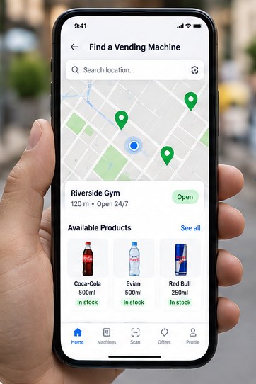
01. Customer app
Discover · Check · Choose
Help customers find nearby machines and understand product availability before walking over. The experience should reduce uncertainty without promising more accuracy than the underlying data supports.
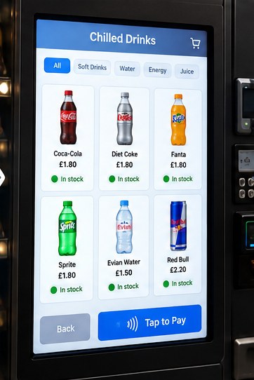
02. Vending machine interface
Browse · Select · Purchase
Make availability and product selection clear at the point of purchase. The machine becomes a direct part of the connected service, not an isolated terminal.
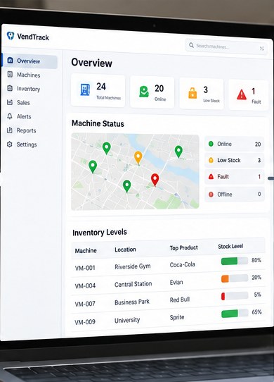
03. Retailer dashboard
Monitor · Prioritise · Replenish
Give retailers a view of machine and stock status that supports practical decisions about which locations need attention and when.
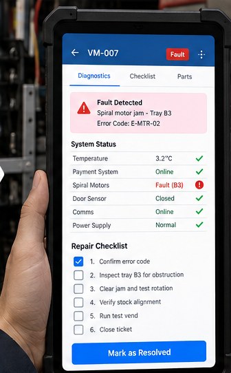
04. Maintenance tool
Diagnose · Prepare · Resolve
Help technicians understand reported faults, prepare for service visits and record completed work. Design around the reality of field work rather than an idealised workflow.
A consistent system, not four separate designs
The shared design system needed to make machine status, availability and fault information recognisable across interfaces. Consistent terminology and status definitions were as important as visual consistency.
At the same time, the products had different contexts of use. A customer needed speed and clarity; a retailer needed prioritisation; a technician needed actionable diagnostic context.
The objective was consistency where information was shared and flexibility where work differed.
06 — Putting the service in people’s hands
We structured validation around three audiences: customers, store managers and technicians. Each group was given prototypes relevant to its part of the service.

The purpose was to assess more than whether each screen made sense on its own. We needed to understand whether information and actions remained coherent when work moved between people.
The validation framework focused on three questions:
-
Comprehension: Could people understand the information presented and what it meant for their task?
-
Actionability: Did the interface help them decide what to do next?
-
Continuity: Did the information remain useful as the service moved between customers, retailers and technicians?
What we tested
| Participants | Prototype fidelity |
|---|---|
| 18 in total: 8 customers, 6 retail staff, 4 technicians | High-fidelity interactive prototype (Framer) with simulated hardware screens |
What we found, and what changed
| Finding | Design change |
|---|---|
| Customers struggled to find machines quickly. 9 of 10 customers wanted real-time stock information on the map before travelling to the machine. | Added live stock indicators on the map. Key product availability, such as in-stock badges, so people can choose a machine with their preferred drink. |
| Product availability was unclear on the machine screen. 5 of 8 participants didn’t immediately notice which items were out of stock. | Clearer availability labels on the touchscreen. Green and red stock indicators, plus an “Out of stock” state with greyed-out images. |
| Retailers wanted clearer at-a-glance status. All 6 retail participants asked for a map view and low-stock alerts. | Improved retailer dashboard. Added a map view, colour-coded status and low-stock alerts, with filtering by location and product. |
| Technicians needed more actionable diagnostics. 3 of 4 technicians said error codes alone weren’t enough and wanted step-by-step repair guidance. | Enhanced maintenance tool. Added fault descriptions, likely causes and a step-by-step repair checklist with linked diagrams. |
07 — What changed, and how to measure impact
The project proposed a connected service, but its operational impact must be distinguished from the design intent.
The most useful outcome measures would sit across the service rather than focus exclusively on app engagement.
| Service area | Outcome to investigate | Evidence required |
|---|---|---|
| Customer experience | Fewer unsuccessful visits | Availability accuracy and observed purchase outcomes |
| Retail operations | Better replenishment decisions | Stockout duration, replenishment frequency and staff effort |
| Maintenance | More effective service visits | Repeat visits, first-time fix rate and diagnostic time |
| Machine performance | Better visibility of faults | Fault detection and resolution timestamps |
| Overall service | More reliable availability | Machine uptime and product availability over time |
These are proposed measures, not claimed results. Any published outcome should include a verified baseline, measurement period and source.
This is also where the service proposition becomes an operational commitment. Showing availability is only valuable if the information is sufficiently current. Showing a fault is only useful if someone can act on it. The quality of the customer-facing experience depends on the reliability of the service behind it.
08 — What I learned
The best design opportunity wasn’t the customer app. It was the van, the stockroom and the spreadsheet behind the machine.
This project reinforced the importance of looking beyond the most visible interaction to understand the service that makes it possible.
The vending machine was where the customer experienced the problem, but the causes could sit elsewhere: in stock management, information handoffs, maintenance workflows or the way decisions were made across the operation.
That changed how I frame connected product problems. Rather than starting with a list of screens, I start by examining the relationships between people, information, decisions and operational constraints.
It also reinforced a distinction between designing a connected experience and simply connecting interfaces. The former requires shared information, clear responsibilities and a coherent model of how work gets done. The latter can leave the original fragmentation intact behind a more polished front end.
For me, the lasting lesson is that service design creates value by improving the conditions in which every individual interaction succeeds.
That is the perspective I bring to complex product and service challenges today: understand the system, make the invisible work visible, and design the connections that allow people to act with greater clarity.