Physical · 2026
Dopashop
A playful retail experience designed to cleanse your dopamine, not drain it.
- Status
- Shipped
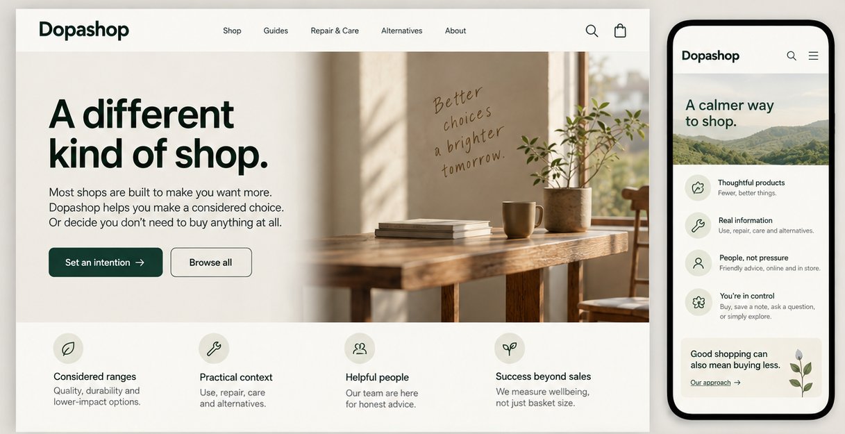
Most shops are built to make you want more. Dopashop asks what a shop would look like if it did the opposite.
The idea: a shop that helps you make a considered choice. Or decide you don’t need to buy anything at all.
It’s a proposition about incentives, not interior styling. If the business still only rewards basket size, the calm won’t last. So the service has to line up the promise to visitors with staff, stock, pricing and how success gets measured.
A proposed visit
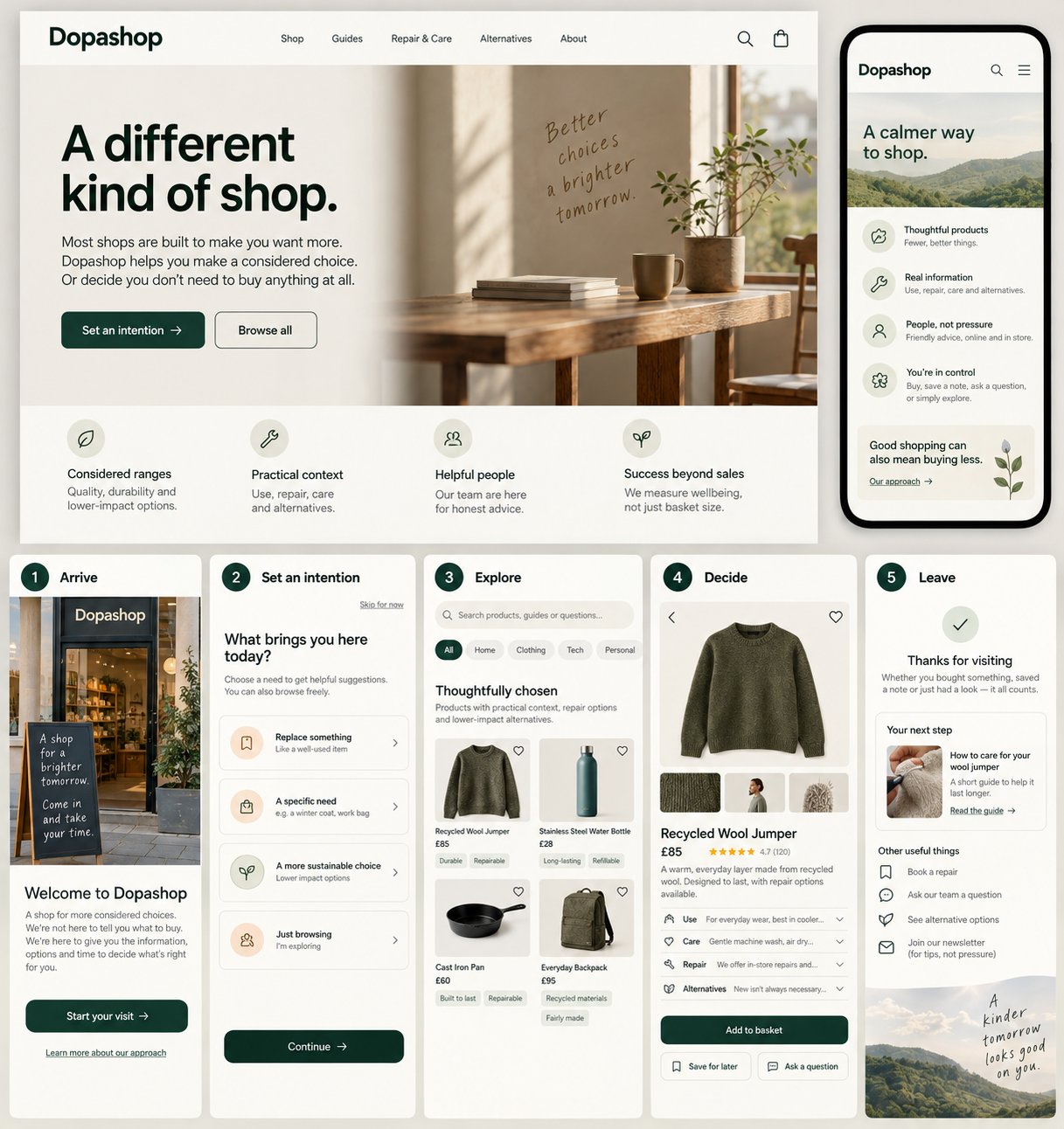
- Arrive. A short welcome explains the idea, without shaming ordinary shopping.
- Set an intention. Choose a need, browse freely, or skip this step.
- Explore. Products come with practical context: use, repair, care and alternatives.
- Decide. Buy, save a note, ask a question, or leave without a purchase.
- Leave. The visit ends with a useful next step, not a last-minute pressure tactic.
Problem
Most retail is optimised for urgency, novelty and buying more. Dopashop explores the opposite: a shop that supports a considered choice, including leaving with nothing.
Research
Planned: desk research into retail cues, a walkthrough audit of common shop patterns, and short conversations about what makes shopping feel pressured.
Prototype
A service blueprint that links what visitors do to staff roles, stock and backstage operations. [Verify: any spatial or clickable prototypes]
In people’s hands
Next: walk peers and potential visitors through the concept, and ask what they think the shop wants them to do.
What happened
The risk I'm watching: a calm space can still feel vague. Removing pressure isn't the same as removing useful guidance.
What’s next
Pilot one small zone, watch whether people understand their choices, and test if it can work commercially without fake urgency.
How I’m approaching it
The Double Diamond, as planned. Plans loop back once real people get involved, so this one does too.
- Discover
Map the retail cues that push people to buy more.
- Define
Name the core tension: a shop still has to make money, and visitors deserve real agency.
- Develop
Prototype a visit and the backstage operations behind it, starting from the service blueprint.
- Deliver
Walk people through the concept and watch where it confuses them.
- Develop
Go back to the blueprint wherever staff actions or stock handling are unclear.
- Deliver
Define a small pilot, and how it will be judged, before claiming anything works.
UX practices
- Choice architectureA few meaningful paths, without nudging anyone toward a purchase they don't need.
- Plain-language wayfindingThe space explains what it's for, including that leaving without buying is fine.
- Inclusive interactionBrowse, ask, read or just walk through, with no social pressure either way.
Service design
- Service blueprintingVisitor actions connect to staff roles, stock processes, policies and support.
- Metrics and incentivesMeasure usefulness, trust and repeat intent alongside revenue, and define them before claiming impact.